I thought I would share with you a basic outline of my painting process. This will be mainly concentrated on how I use colour.
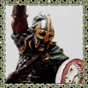
For this demonstration I am going to paint one of the old metal wood elves. This is quite a tricky model due to the layers of clothing and some care needs to be taken to create a balanced composition.
I've chosen an Autumn theme so oranges and reds will be the dominant colours. With this in mind my first paint selection is bloodstone from P3 which is a warm orange/brown. To complement this my second base colour is military green from vallejo model colour. My final base colour is midlund flesh (p3) for the skin tone.
To expand my palette I then add my "go to" paints of:
dark sea green (vmc) - dark blue/green
hull red (vmc) - dark red
frostbite (p3) - pastel blue
menoth white highlight (p3) - ivory
umbral umber (p3) - umber
with these paints I can just about highlight and shade almost any other colour. I then proceed to mix these together on my palette. I use a wet palette partly out of necessity - it's very hot here and my paints would dry out very quickly otherwise - and also because I like to have all of my paints available throughout.
This is my starting palette:

For priming I would ideally use the preshading technique whereby I prime first grey and then do an overhead spray of white. I've been having problems with this, I think because of the high humidity, with the priming leaving a grainy/furry texture. For my main painting I am now using only grey primer but for the purposes of this demonstration I have preshaded the model

Once the primer is dry I basecoat all of the model with the aim of covering in two layers. After the first layer I review the overall balance of the colours and make any adjustments with the subsequent layer. In this case I didn't like the pale red I had used as I felt it drew the eye away from the face and towards the lower half of the mini. I also added some yellow to my palette for the hair to add a little variety. At this stage the preshading is still quite noticable.


For the shading I prefer to use complementary mixes of the basecolours rather than a straight dark colour. So for the green and red I used a mix of green and red! For orange I used an orange and green/blue mix.
I thinned the paint a little more and applied it neatly as a glaze. I try to avoid any pooling by picking up small amounts of paint at a time and using the brush to push the paint into the shadow areas.
I use the preshading and an overhead lamp to work out where to place the shadows.
I added further shading using very thin military green and dark sea green mix. The general idea is that cold colours will appear further away and by using this temperature difference I can add more contrast.

Before I added the highlights I did some thin glazes of the base colours to smooth the transitions and to bring out the colour following the shading.

The highlighting is done in a reverse of the shading. I use warm mixes and push the paint towards the light. This again takes a couple of layers.


I still need to finish off the final details and the base but hopefully this gives you an idea of my approach. To get the model to this stage took less than two hours and that included a couple of breaks and having to stop to take photos. Apart from the graininess I think it's an acceptable tabletop standard. If I wanted a higher standard I would do a lot more glazes, switching between dark and light, for smoother transitions and add more detail by working on increasingly smaller sections.
_________________
My website@opponenttheory on instagram
 Top
Top Top
Top Top
Top Top
Top Top
Top Top
Top Top
Top Top
Top Top
Top Top
Top Top
Top Top
Top Top
Top Top
Top Top
Top Top
Top Top
Top Top
Top Top
Top Top
Top


