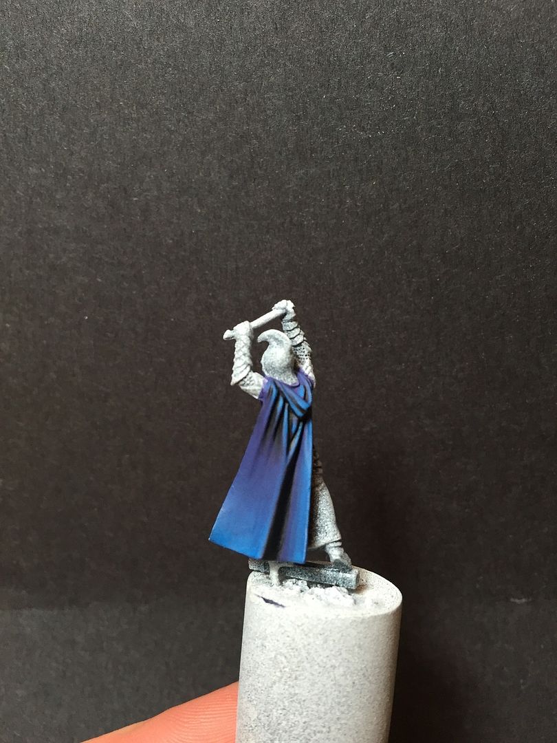
Looking really nice.

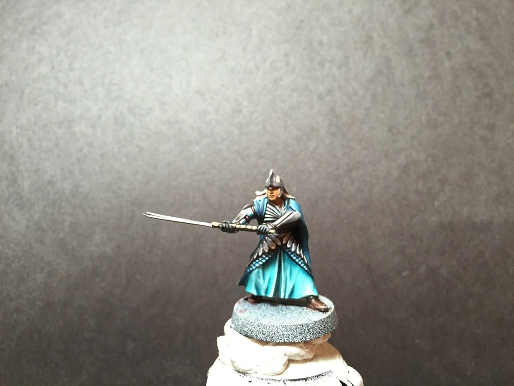
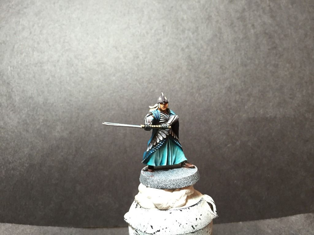
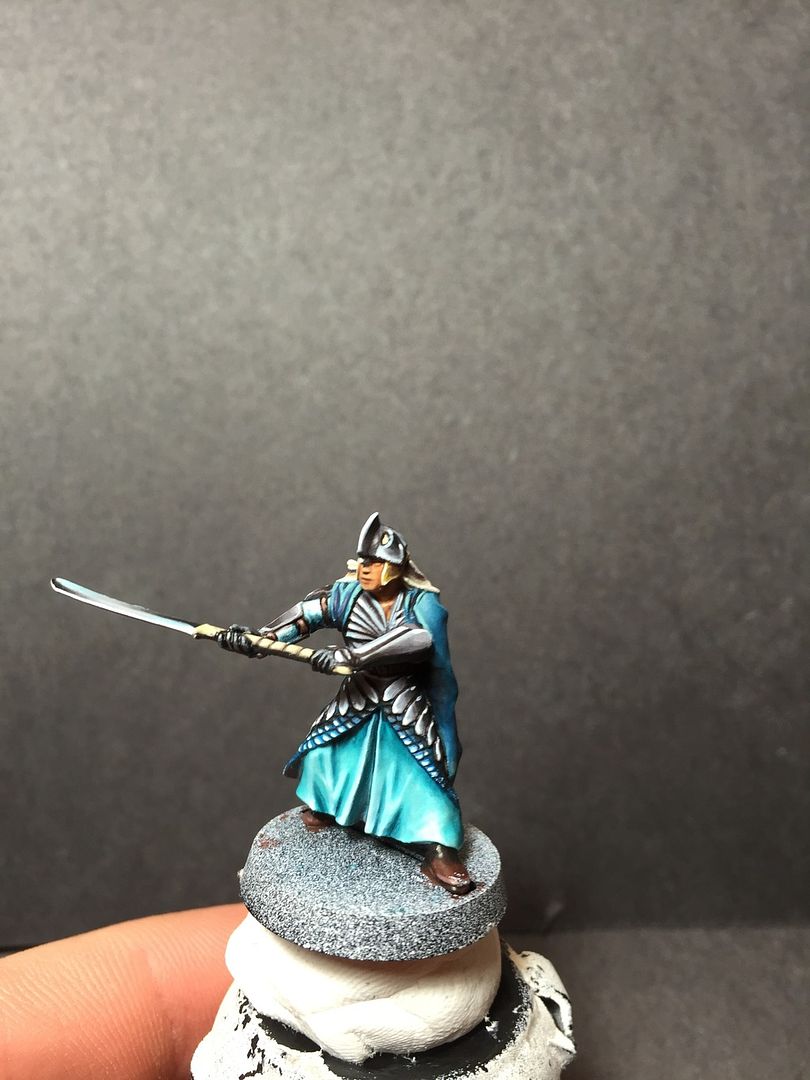
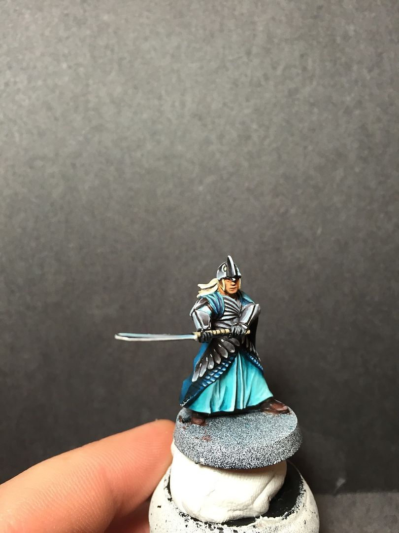
I will however give some feedback of my first impression when looking at it. The first thing I noticed, (other than that it's a beautifully painted figure) is that the face seems to stick out. I think it is because everything else is painted with such high contrast and sharp edge highlights, the skin looks a little flat in comparison. It's not so much that it is flat, but that it's painted in a different style than the rest of the figure, which makes it look flat, if that makes sense. I think a few very small/light edge highlights on the nose tip, cheekbones, etc, would help.
I also then noticed that the boots look a little drab too. It looks like a basic basecoat/wash/highlight job. I'm no good myself at getting boots to look really nice, as there seems to be no substance to highlight, no folds like on a cloak. I however think that they stand out a lot because most of the rest of the figure is a blue/silver bright colour. I also know that on a figure you want to figure out what the focus point will be and make the area superb, and then you shouldn't make everything pop just as much, or your focus will get lost in all the details. However, in this case I think it needs a little something more to stop it from being a distraction.
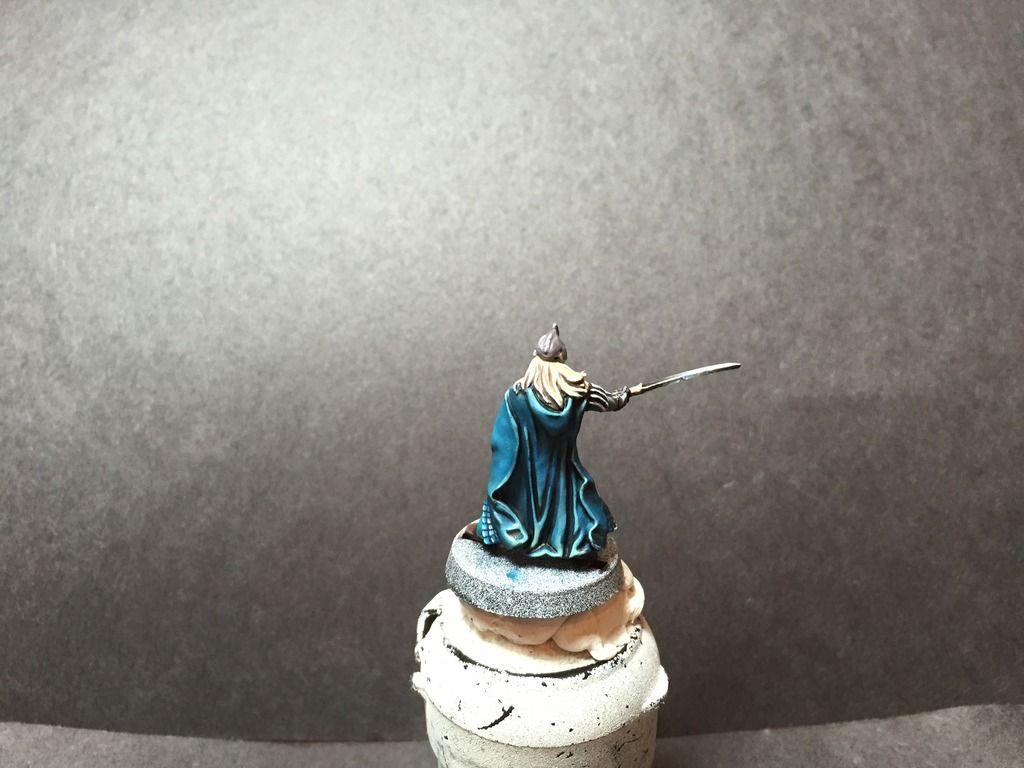
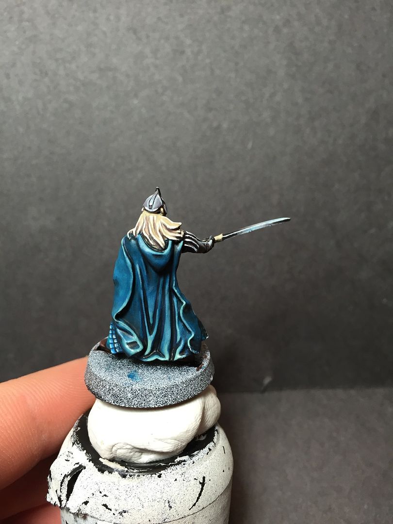
Wow, lots of words, and not a ton of them were super encouraging. I do really like the figure, and that NMM is great, much better than anything I could do. I just wanted to give some honest feedback as to what I saw when I looked at the figure to help push you to be the best you can. I know another perspective has helped me in the past when I can't see things that need improvement because I've looked at the figure for way too many hours already.

Keep up the great work!

 Top
Top Top
Top Top
Top Top
Top Top
Top Top
Top Top
Top Top
Top Top
Top Top
Top Top
Top Top
Top Top
Top Top
Top Top
Top Top
Top Top
Top Top
Top Top
Top Top
Top


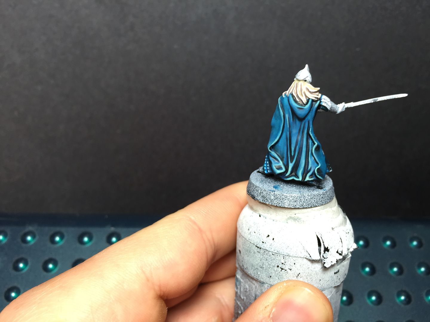
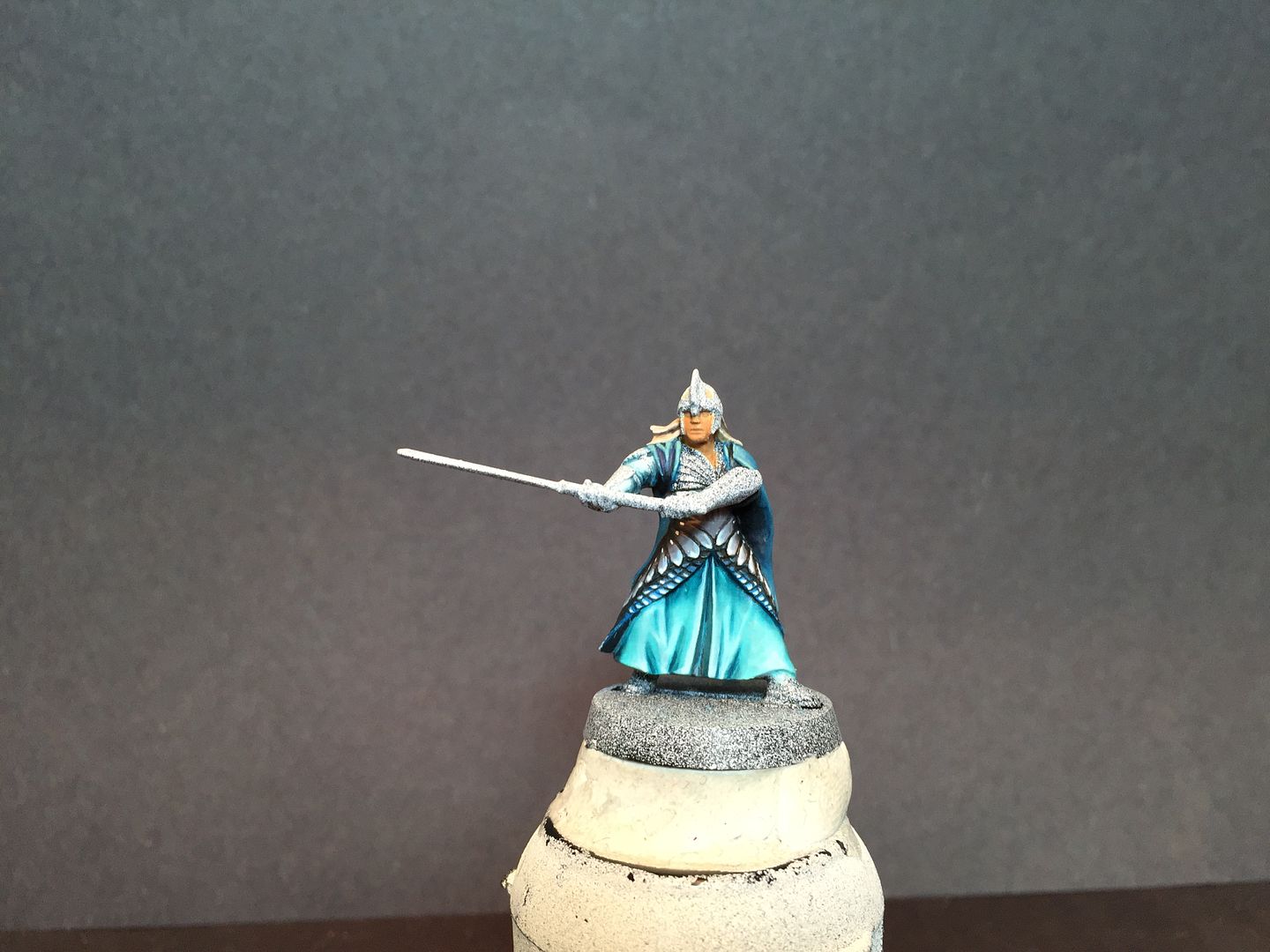
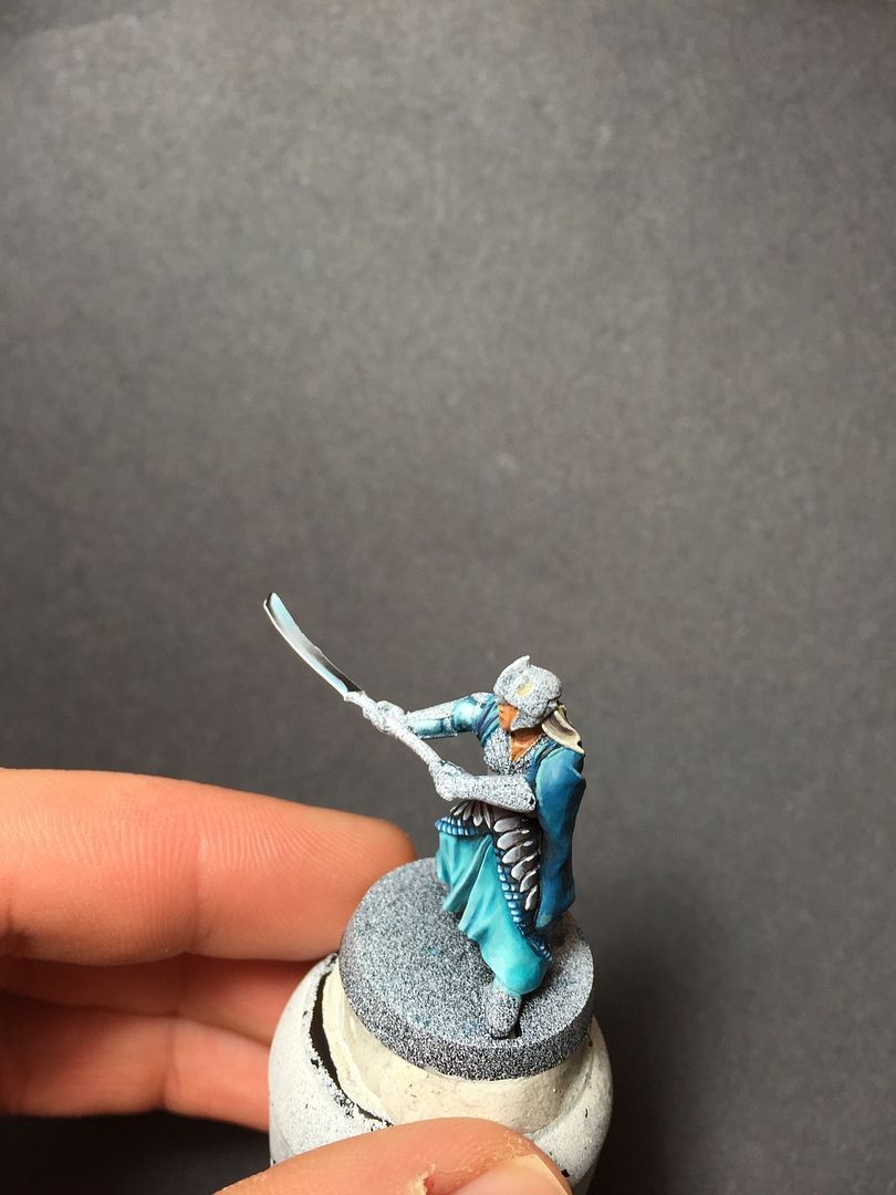




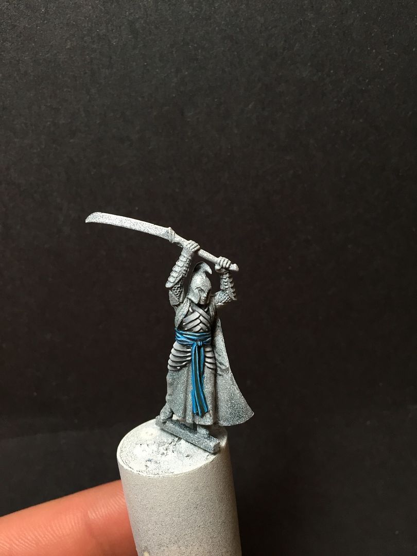

 Quality nmm for sure! I wish you the best in your effort!
